WE DESIGN, BUILD AND SUPPORT WEBSITES THAT OPTIMISE YOUR BUSINESS IN A BUSY WEB WORLD

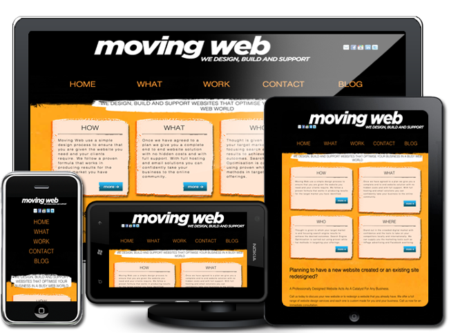
Responsive Web Design
The New SEO Standard, Author: Eric Rudolphe
With so many new devices arriving on the market and all with different screen sizes and viewable as landscape or portrait mode, responsive web design fits perfectly to take advantage of this.
Up until recently designing a mobile-specific site was the industry standard but this is no longer necessary. The advent of responsive web design must be seen as the new design standard and will become the mainstream for designers going forward.
Responsive design was conceived by Ethan Marcotte and is quickly becoming a new standard. Responsive design is a combination of fluid structure and CSS3 media queries.
A responsive site transforms based on the size of the viewport it is being displayed in. At certain breakpoints (768px, the width of an iPad for instance) CSS rules change slightly to fit a viewport’s size.
The importance of Responsive web design
In the not too distant past the 800 x 600 screen size was the common size and with the advent of affordable wide screen LCD displays 1200 x 800 became the most popular viewing size for desktop and laptop computers. With the emergence of smart phones and tablets it is now even more important to take into consideration what your viewers will be using to browse your web site.
The vast array of viewing devices is no doubt what has led to the advent of responsive web design and fitting in with the capabilities of new and old devices as well as any future devices still to be released. This deluge of new devices has made many web sites not viewable on these new devices and subsequently loss of visitors to older designed web sites.
It is not only the new browsing devices that readily accept responsive web designed sites but even search engines such as goggle as seen in this blog post from Google.
"Sites that serve all devices on the same set of URLs, with each URL serving the same HTML to all devices and using just CSS to change how the page is rendered on the device. This is Google’s recommended configuration.
Simply put If your website only has one address (URL) for each page then the search results pointing to those pages will be higher than if the same page has multiple addresses' (URLs.) Likewise if your mobile website sits at a different sub domain then the power of those links will be diluted.
Benefits for users
This has to be the foremost incentive to build or re-design a site using the responsive design technique. Users will be able to view your site best suited for the viewing area available including touch elements and deciding what not display for the area available.
Web owners will get the added advantage of future proofing there site for new devices. The use of Responsive Web design will also enable a further reach from a wider reach of potential users utilising a wide range of devices.
A design not incorporating responsive web design will when viewing the web world on a smart phone can be a very eye-straining experience! A large percentage of web sites including some rather major sites can be very unusable or totally inaccessible on many small screen devices.
Mentioned is just the beginning when it comes to the advantages of responsive design. What is even better is that it is not just the future but the present that will take full advantage of this revolutionary design technique.
How responsive design works
Simply put responsive design can be broken down into three elements:
- Flexible grids
- Flexible images and
- Media queries
The common factor is that elements including images, columns and text sizes are not set in pixel sizes but rather a percentage of the maximum viewing size set by the device the site is viewed on.
For example of if you were to incorporate a header into a maximum width page of 980px and the width of this header was to be 700px then you would use the standard formula of "the target" ÷ "the context. As a result, we simply divide 700px "the target" by 980px "the context" like so:
"target" ÷ "the context"
700 ÷ 980 = 0.7142
This would be 0.7142 = 71.42%
Flexible images use a even simpler method in the following manner:
img { max-width: 100%;
      min-width:50%;
    }
These style setting are then positioned with media queries targeting specific screen sizes or whether the device is operating in the landscape or portrait mode.
Media queries would target either minimum or maximum size of the screen or a combination of min and max as seen in the examples below showing the body width of the web site for each screen size.
/* Media queries */
@media screen and (max-width: 1200px) {
    body{
    width:1000px;
    margin:0 auto;
    }
}
 @media screen and (max-width: 980px) {
body{
    width:850px;
    margin:0 auto;
    }
}
 @media screen and (max-width: 750px) {
    body{
    width:600px;
    margin:0 auto;
    }
}
@media screen and (max-width: 540px) {
    body{
    width:450px;
    margin:0 auto;
    }
}
@media screen and (max-width: 380px) {
    body{
    width:360px;
    margin:0 auto;
    }
}
In conclusion
The guru of Responsive Web Design is considered to be Ethan Marcotte and viewing his blog makes for excellent reading. He is also the author of Responsive Web Design available at A Book Apart website.